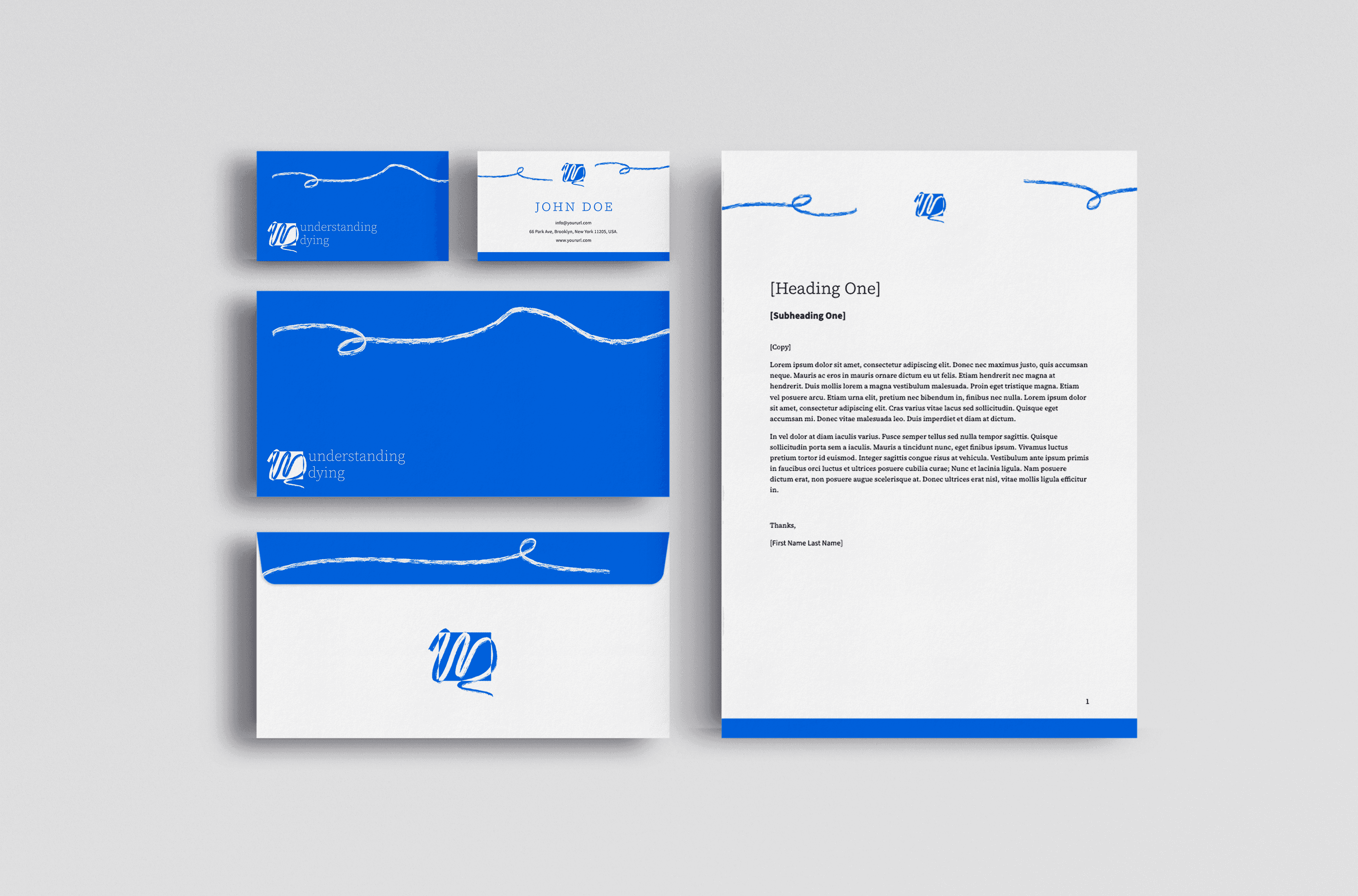
Understanding Dying
The team behind Understanding Dying approached us with a complex challenge: how to create a sensitive, yet impactful brand and a platform designed to navigate the emotional complexities of death and end-of-life care. As the lead designer for this project, I collaborated closely with Anna Koch, a fellow designer at Emergence Creative, to develop a cohesive brand identity that would resonate with both families and healthcare professionals. Through extensive research, interviews, and landscape analysis, we explored users' needs and sensitivities surrounding death, ensuring the design would be not only visually appealing but also emotionally appropriate and supportive.
Requirements & Result
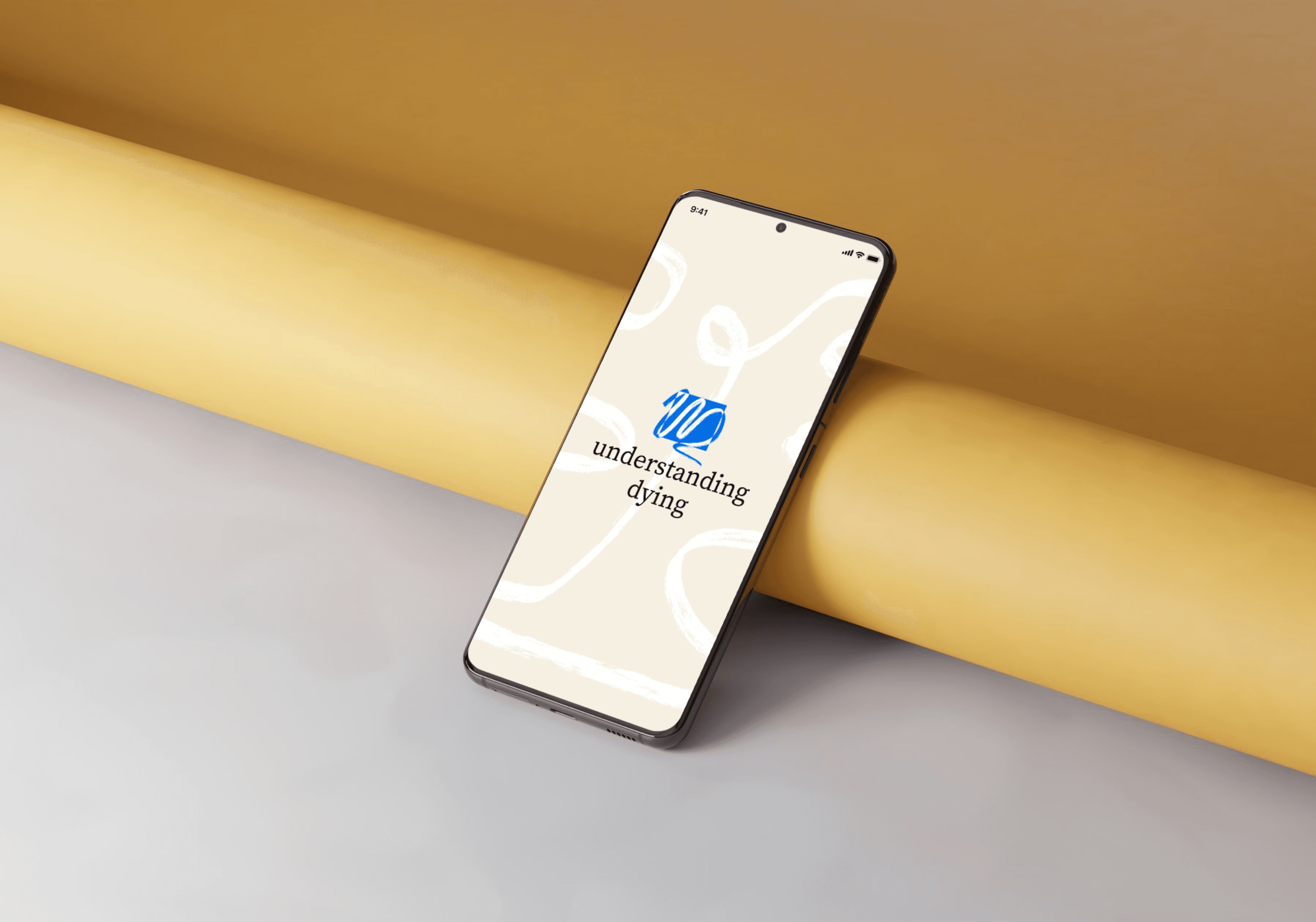
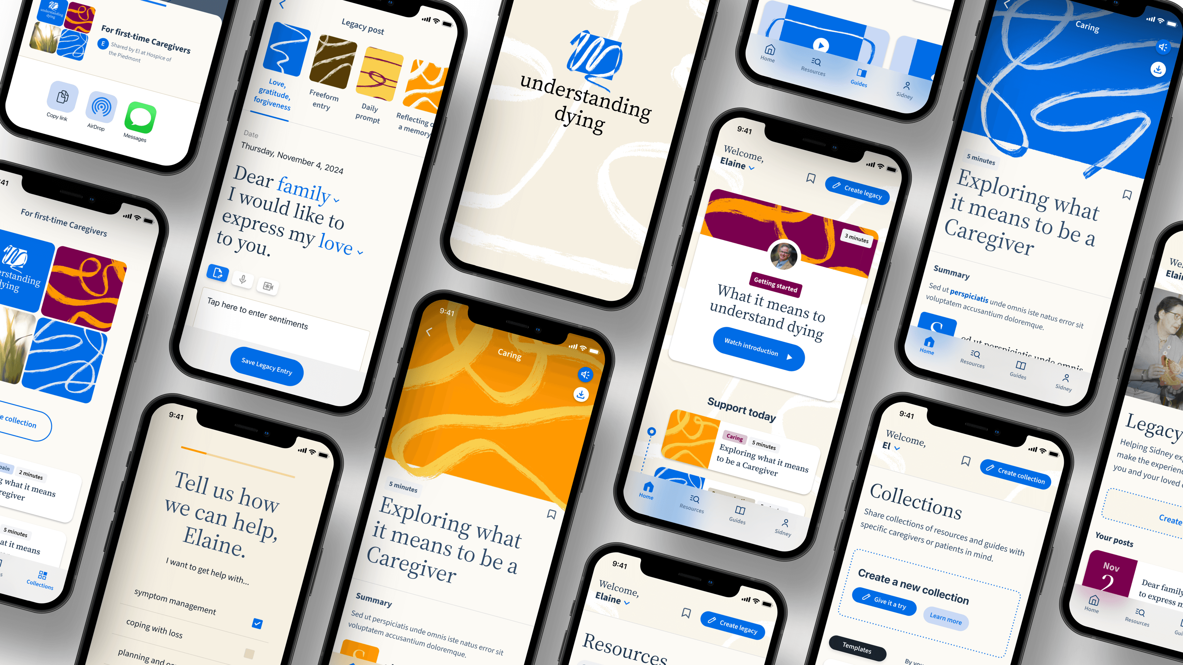
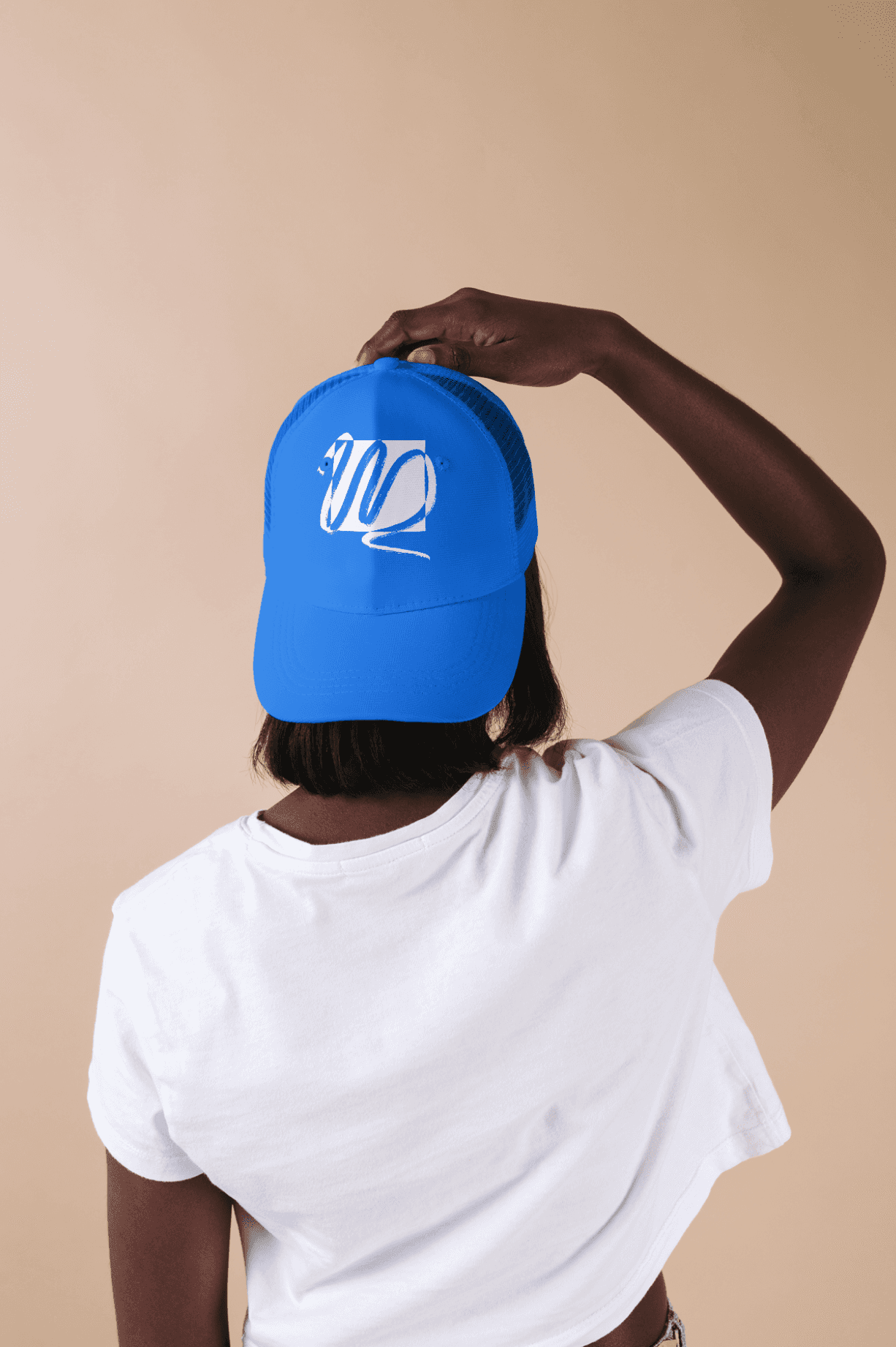
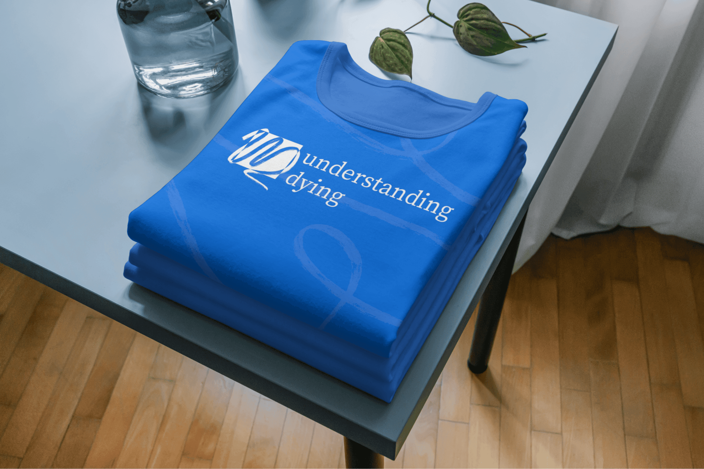
Our goal was to define a brand that would establish trust, foster understanding, and encourage meaningful conversations around end-of-life issues, balancing sensitivity and clarity every step of the way. We crafted a brandbook with a logo, typography, colour palette, and imagery guidelines that evoked a sense of peace and trust, alongside templates and mockups for various digital touchpoints. Working alongside Willowtree, we supported them in bringing our designs to life with a high-fidelity prototype and helped strategize user journeys. The resulting brand identity is both calming and empowering, providing a sense of comfort for users by focusing on clear communication, emotional resonance, and accessibility.
Wanna chat more?
let’s collaborate, or just talk design!